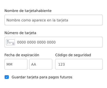
Input styles
The first thing you can customize are the inputs that will be presented to your customer. The following are each configurable option in theinputStyles property of the custom styles:
| Field | Description |
|---|---|
base | Base customizations for all inputs. |
cardIcon | Customization for the card icon inside the card number input. |
complete | Customizations for a correct filled input. |
empty | Customizations for an empty input. |
focus | Customizations for a focused input. |
invalid | Customizations for when an input is incorrectly filled. |
global | Global customizations |
Custom Styles with input styles customization
Custom Styles with input styles customization
Placeholders
To change the texts presented as placeholder for each input, you need to add theplaceholders property to the custom styles, as presented below:
Custom Styles with placeholders customization
Custom Styles with placeholders customization
Labels
You can also customize the labels for the inputs by adding alabelStyles property to your custom styles object. This new property is an object’s object with a base configuration, as exemplified below:
Custom Styles with labels styles customization
Custom Styles with labels styles customization
Labels texts
To change the texts presented above each input as labels, you need to add thelabels property to the custom styles, as presented below:
Custom Styles with labels texts customization
Custom Styles with labels texts customization
Error text styles
To customize the text appearance when a input is incorrectly filled you need to add thelabelStyles property to the custom styles. An example of this property inside the custom styles object is presented below:
Custom Styles with error text styles customization
Custom Styles with error text styles customization