Features and Benefits
The Lite SDK grants direct access to a variety of essential features and benefits:- Payment Processing: Handle payments with ease and security.
- Card Management: Enroll, save, list, and delete cards.
- Payment Handling: Manage payment methods and tokenized storage.
- Manual Payment Flow Control: Gain full control over how payments are processed in your application.
- Flexible UI Customization: Tailor the UI to match your brand’s design and user experience.
Integration Steps
With the Lite integration you can create a payment screen, as well as enroll and manage cards. Below are two step guides, one to create a payment screen, and the second to create a card enrollment one.Payment Screen
Payment Screen
The Lite integration allows you take full advantage of individual components for a custom payment UI. You’ll create the payment screen following the steps below:After these steps, you have completed the integration. The following image exemplifies how the SDK will look in your app: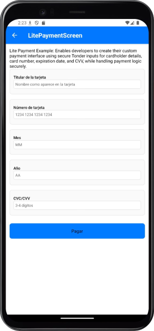
The first and second steps are identical to the enrollment screen steps.
Setup Tonder Provider
You need to start by setting up Tonder’s Provider into your application. Below are the available base configurations for the Provider:
The following code integrates our provider into the App component:
| Property | Type | Required | Description |
|---|---|---|---|
mode | 'development' | 'production' | 'sandbox' | Yes | Specifies the environment mode for the SDK. Use development for testing, production for live operations, or sandbox for isolated testing. |
apiKey | string | Yes | Your unique Tonder Public API key used to authenticate SDK requests. |
type | SDKType | Yes | Indicates the integration type. Options: INLINE for inline integration, LITE for lightweight use, or ENROLLMENT for enrollment workflows. |
returnURL | string | No | The URL to redirect users to after completing the 3DS authentication process. |
Remember to add the correct SDK type in the provider configuration.
Obtain a Secure Token
Before initialzing the mobile SDK, your checkout page should obtain the security token for card functionalities (save, delete, list). This should be obtained through your backend for security.
For detailed implementation instructions and best practices, please refer to the How to use SecureToken for secure card saving guide.
Gather Payment and Customer Data
Before creating the mobile SDK, your checkout page should already:
- Show the products being purchased and the total amount.
- Collect any required customer information.
Enrollment Screen
Enrollment Screen
The Lite integration allows you to enroll cards, while taking advantage of individual components for a custom payment UI. You’ll create the enrollment screen following the steps below:
The first and second steps are identical to the payment screen steps.
Setup Tonder Provider
You need to start by setting up Tonder’s Provider into your application. Below are the available base configurations for the Provider:
The following code integrates our provider into the App component:
| Property | Type | Required | Description |
|---|---|---|---|
mode | 'development' | 'production' | 'sandbox' | Yes | Specifies the environment mode for the SDK. Use development for testing, production for live operations, or sandbox for isolated testing. |
apiKey | string | Yes | Your unique Tonder Public API key used to authenticate SDK requests. |
type | SDKType | Yes | Indicates the integration type. Options: INLINE for inline integration, LITE for lightweight use, or ENROLLMENT for enrollment workflows. |
returnURL | string | No | The URL to redirect users to after completing the 3DS authentication process. |
Remember to add the correct SDK type in the provider configuration.
Obtain a Secure Token
Before initialzing the mobile SDK, your checkout page should obtain the security token for card functionalities (save, delete, list). This should be obtained through your backend for security.
For detailed implementation instructions and best practices, please refer to the How to use SecureToken for secure card saving guide.
Gather Customer Data
Before creating the mobile SDK, your checkout page should already have collected any required customer information.
Lite Methods
The Lite integration provides full control over the payment flow with individual components and direct access to all SDK functionalities.payment: Processes a payment using the configured payment data.saveCustomerCard: Tokenizes and saves the current card information.getCustomerCards: Retrieves the list of saved cards for the customer.getPaymentMethods: Retrieves available payment methods.removeCustomerCard: Deletes a saved card.
If there are any changes to the payment or customer data, you can pass the updated data again when calling the payment function.
Reference
Find below reference tables and interfaces for the methods and features found at the React Native guides.ILiteCheckoutOptions
ILiteCheckoutOptions
| Option | Type | Required | Description |
|---|---|---|---|
paymentData | IBaseProcessPaymentRequest | Yes | Contains the payment information, including customer and cart data necessary for the transaction. |
customization | IInlineCustomizationOptions | No | Options for customizing the user interface of the payment process. |
callbacks | IInlineCallbacks | No | Functions to handle callback events during the payment process, such as success or failure. |
returnURL | string | No | The URL to redirect users to after completing the 3D Secure (3DS) authentication process. |
Callbacks Structure
Callbacks Structure
| Callback | Parameters | Description | Return |
|---|---|---|---|
beforePayment | none | Triggered before the payment process begins. Use this to display a loading state, validate data, or perform pre-payment tasks. | Promise |
onFinishPayment | response: IBaseResponse<ITransaction> | Called when the payment process finishes (success or error). Provides the result of the transaction or error details. | Promise |
Payment Data
Payment Data
Customer information
| Field | Type | Required | Description |
|---|---|---|---|
email | string | Yes | Customer’s email address. |
firstName | string | Yes | Customer’s first name. |
lastName | string | Yes | Customer’s last name. |
phone | string | No | Customer’s contact phone number. |
address | string | No | Customer’s street address. |
city | string | No | Customer’s city. |
state | string | No | Customer’s state or province. |
country | string | No | Customer’s country. |
postCode | string | No | Customer’s postal or ZIP code. |
Cart Information
| Field | Type | Required | Description |
|---|---|---|---|
total | number | Yes | Total amount of the transaction. |
items | Array<IItem> | Yes | Array containing details of items in the cart. |
metadata | Record<string, any> | No | Additional custom data for the transaction. |
currency | string | No | Currency code for the transaction (default: MXN). |
Cart Item Structure
| Field | Type | Required | Description |
|---|---|---|---|
name | string | Yes | Name of the product. |
amount_total | number | Yes | Total amount for the item (calculated as quantity × price). |
description | string | Yes | Brief description of the product. |
price_unit | number | Yes | Unit price of the product. |
product_reference | string | Yes | Unique identifier for the product. |
quantity | number | Yes | Quantity of the product being purchased. |
discount | number | No | Discount amount applied to this item. |
taxes | number | No | Tax amount applied to this item. |
Additional fields for LITE Version
| Field | Type | Required | Description |
|---|---|---|---|
card | string | No | The ID of the card selected by the user. |
payment_method | string | No | The payment method chosen by the user. |
Customization Options
Customization Options
Save Card Options
| Option | Type | Default | Description |
|---|---|---|---|
saveCards.autoSave | boolean | false | Automatically saves the card without displaying the save option to the user. |
Form Labels & Placeholders
Form Labels & Placeholders
For the Lite version, you can pass the respective values directly when using Tonder’s inputs.
Form Labels
| Property | Type | Default | Description |
|---|---|---|---|
name | string | ”Titular de la tarjeta” | Label for the cardholder’s name field. |
cardNumber | string | ”Número de tarjeta” | Label for the card number field. |
cvv | string | ”CVV” | Label for the security code field. |
expiryDate | string | ”Fecha de expiración” | Label for the expiration date fields. |
Placeholders
| Property | Type | Default | Description |
|---|---|---|---|
name | string | ”Nombre como aparece en la tarjeta” | Placeholder for the cardholder’s name field. |
cardNumber | string | ”1234 1234 1234 1234” | Placeholder for the card number field. |
cvv | string | ”3-4 dígitos” | Placeholder for the security code field. |
expiryMonth | string | ”MM” | Placeholder for the expiration month field. |
expiryYear | string | ”AA” | Placeholder for the expiration year field. |