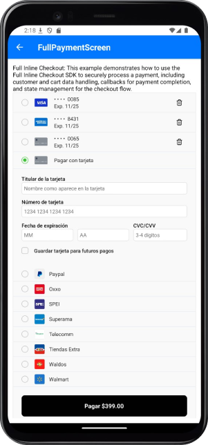
Features and Benefits
The Inline SDK delivers powerful features for streamlined payment experiences:- Pre-Built UI Components: Fully functional payment interface.
- Saved Cards Management: Manage stored cards for returning users.
- Multiple Payment Methods Support: Enable a variety of payment options.
- Built-In Error Handling and Validation: Ensure transactions are smooth and secure.
- Customizable Styling and Layout: Adapt the UI to align with your brand’s design and user needs.
Integration Steps
The following steps show you how to integrate the Inline type into your app:Setup Tonder Provider
You need to start by setting up Tonder’s Provider into your application. Below are the available base configurations for the Provider:
The following code integrates our provider into the App component:
| Property | Type | Required | Description |
|---|---|---|---|
mode | 'development' | 'production' | 'sandbox' | Yes | Specifies the environment mode for the SDK. Use development for testing, production for live operations, or sandbox for isolated testing. |
apiKey | string | Yes | Your unique Tonder Public API key used to authenticate SDK requests. |
type | SDKType | Yes | Indicates the integration type. Options: INLINE for inline integration, LITE for lightweight use, or ENROLLMENT for enrollment workflows. |
returnURL | string | No | The URL to redirect users to after completing the 3DS authentication process. |
Remember to add the correct SDK type in the provider configuration.
Obtain a Secure Token
Before initialzing the mobile SDK, your checkout page should obtain the security token for card functionalities (save, delete, list). This should be obtained through your backend for security.
For detailed implementation instructions and best practices, please refer to the How to use SecureToken for secure card saving guide.
Gather Payment and Customer Data
Before creating the mobile SDK, your checkout page should already:
- Show the products being purchased and the total amount.
- Collect any required customer information.
Inline Methods
The Inline integration provides methods for handling full payment processing with built-in UI components.create: Initializes the SDK with configuration.reset: Resets the SDK state to its initial values and cleans up resources.payment: Processes a payment using the configured payment data.
The payment function It is only used when you want to control the payment button on your own. Additionally, if there are any changes to the payment or customer data, you can pass the updated data again when calling the function.
Reference
Find below reference tables and interfaces for the methods and features found at the React Native guides.IInlineCheckoutOptions
IInlineCheckoutOptions
| Option | Type | Required | Description |
|---|---|---|---|
paymentData | IBaseProcessPaymentRequest | Yes | Contains the payment information, including customer and cart data necessary for the transaction. |
customization | IInlineCustomizationOptions | No | Options for customizing the user interface of the payment process. |
callbacks | IInlineCallbacks | No | Functions to handle callback events during the payment process, such as success or failure. |
returnURL | string | No | The URL to redirect users to after completing the 3D Secure (3DS) authentication process. |
Callbacks Structure
Callbacks Structure
| Callback | Parameters | Description | Return |
|---|---|---|---|
beforePayment | none | Invoked before the payment process begins. Use this to display a loading state, validate data, or perform pre-payment tasks. | Promise |
onFinishPayment | response: IBaseResponse<ITransaction> | Triggered when the payment process is completed (either success or error). Provides transaction results or error details. | Promise |
beforeDeleteCard | none | Invoked before the delete card process starts. Use this to display a loading state, validate data, or perform pre-deletion tasks. | Promise |
onFinishDeleteCard | response: IBaseResponse<string> | Triggered when the card deletion process is completed (either success or error). | Promise |
Payment Data
Payment Data
Customer information
| Field | Type | Required | Description |
|---|---|---|---|
email | string | Yes | Customer’s email address. |
firstName | string | Yes | Customer’s first name. |
lastName | string | Yes | Customer’s last name. |
phone | string | No | Customer’s contact phone number. |
address | string | No | Customer’s street address. |
city | string | No | Customer’s city. |
state | string | No | Customer’s state or province. |
country | string | No | Customer’s country. |
postCode | string | No | Customer’s postal or ZIP code. |
Cart Information
| Field | Type | Required | Description |
|---|---|---|---|
total | number | Yes | Total amount of the transaction. |
items | Array<IItem> | Yes | Array containing details of items in the cart. |
metadata | Record<string, any> | No | Additional custom data for the transaction. |
currency | string | No | Currency code for the transaction (default: MXN). |
Cart Item Structure
| Field | Type | Required | Description |
|---|---|---|---|
name | string | Yes | Name of the product. |
amount_total | number | Yes | Total amount for the item (calculated as quantity × price). |
description | string | Yes | Brief description of the product. |
price_unit | number | Yes | Unit price of the product. |
product_reference | string | Yes | Unique identifier for the product. |
quantity | number | Yes | Quantity of the product being purchased. |
discount | number | No | Discount amount applied to this item. |
taxes | number | No | Tax amount applied to this item. |
Customization Options
Customization Options
Save Cards Options
| Option | Type | Default | Description |
|---|---|---|---|
saveCards.showSaveCardOption | boolean | true | Displays a checkbox allowing users to choose whether to save their card for future purchases. |
saveCards.showSaved | boolean | true | Shows a list of previously saved cards for the customer. |
saveCards.autoSave | boolean | false | Automatically saves the card without requiring the user to select the save option. |
saveCards.showDeleteOption | boolean | true | Displays a delete button for each saved card in the list. |
Payment Button Options
| Option | Type | Default | Description |
|---|---|---|---|
paymentButton.show | boolean | true | Controls the visibility of the payment button. |
paymentButton.text | string | 'Pagar' | Custom text displayed on the payment button. |
paymentButton.showAmount | boolean | true | Displays the payment amount on the button (e.g., “Pay $100”). |
Payment Methods Options
| Option | Type | Default | Description |
|---|---|---|---|
paymentMethods.show | boolean | true | Controls the visibility of the alternative payment methods section. |
Card Form Options
| Option | Type | Default | Description |
|---|---|---|---|
cardForm.show | boolean | true | Controls the visibility of the card input form. |
General Options
| Option | Type | Default | Description |
|---|---|---|---|
showMessages | boolean | true | Controls the visibility of error and success messages. |
labels | object | - | Custom labels for form fields (see Form Labels section). |
placeholders | object | - | Custom placeholder text for form inputs (see Form Placeholders section). |
styles | object | - | Custom styles for UI components (see Styling section). |
Form Labels & Placeholders
Form Labels & Placeholders
Form Labels
| Property | Type | Default | Description |
|---|---|---|---|
name | string | ”Titular de la tarjeta” | Label for the cardholder’s name field. |
cardNumber | string | ”Número de tarjeta” | Label for the card number field. |
cvv | string | ”CVV” | Label for the security code field. |
expiryDate | string | ”Fecha de expiración” | Label for the expiration date fields. |
Placeholders
| Property | Type | Default | Description |
|---|---|---|---|
name | string | ”Nombre como aparece en la tarjeta” | Placeholder for the cardholder’s name field. |
cardNumber | string | ”1234 1234 1234 1234” | Placeholder for the card number field. |
cvv | string | ”3-4 dígitos” | Placeholder for the security code field. |
expiryMonth | string | ”MM” | Placeholder for the expiration month field. |
expiryYear | string | ”AA” | Placeholder for the expiration year field. |
Styling
Styling
The style customization for Full integrations (Inline and Enrollment) is done through a styles object in the SDK configuration.
Main Container
| Component | Description | Properties |
|---|---|---|
sdkCard | Main container of the SDK. | base: StylesBaseVariant |
Card Form
| Component | Description | Properties |
|---|---|---|
cardForm | Card form section. | base: StylesBaseVariant |
inputStyles: CollectInputStylesVariant | ||
labelStyles: CollectInputStylesVariant | ||
errorStyles: StylesBaseVariant |
Saved Cards
| Component | Description | Properties |
|---|---|---|
savedCards | Saved cards list section. | base: StylesBaseVariant |
radioBase: ViewStyle | ||
radioInner: ViewStyle | ||
radioSelected: ViewStyle | ||
cardIcon: ViewStyle | ||
deleteButton: ViewStyle | ||
deleteIcon: ViewStyle |
Payment Methods
| Component | Description | Properties |
|---|---|---|
paymentMethods | Payment methods section. | base: StylesBaseVariant |
radioBase: ViewStyle | ||
radioInner: ViewStyle | ||
radioSelected: ViewStyle |
Payment Radio
| Component | Description | Properties |
|---|---|---|
paymentRadio | Payment method selector. | base: StylesBaseVariant |
radioBase: ViewStyle | ||
radioInner: ViewStyle | ||
radioSelected: ViewStyle |
Payment Button
| Component | Description | Properties |
|---|---|---|
paymentButton | Payment button. | base: ViewStyle |
Error Message
| Component | Description | Properties |
|---|---|---|
errorMessage | Error message display. | base: TextStyle |
Success Message
| Component | Description | Properties |
|---|---|---|
successMessage | Success message display. | base: TextStyle |
Full customization example
Full customization example