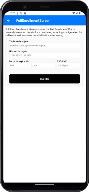
Features and Benefits
The Enrollment SDK provides features that support secure and efficient card handling:- Card Tokenization: Convert card details into secure tokens for future transactions.
- Card Validation: Ensure the accuracy and validity of card information during the enrollment process.
- Secure Storage: Store card data securely and comply with industry standards.
Integration Steps
The following steps show you how to integrate the Enrollment type into your app:Setup Tonder Provider
You need to start by setting up Tonder’s Provider into your application. Below are the available base configurations for the Provider:
The following code integrates our provider into the App component:
| Property | Type | Required | Description |
|---|---|---|---|
mode | 'development' | 'production' | 'sandbox' | Yes | Specifies the environment mode for the SDK. Use development for testing, production for live operations, or sandbox for isolated testing. |
apiKey | string | Yes | Your unique Tonder Public API key used to authenticate SDK requests. |
type | SDKType | Yes | Indicates the integration type. Options: INLINE for inline integration, LITE for lightweight use, or ENROLLMENT for enrollment workflows. |
returnURL | string | No | The URL to redirect users to after completing the 3DS authentication process. |
Remember to add the correct SDK type in the provider configuration.
Obtain a Secure Token
Before initialzing the mobile SDK, your checkout page should obtain the security token for card functionalities (save, delete, list). This should be obtained through your backend for security.
For detailed implementation instructions and best practices, please refer to the How to use SecureToken for secure card saving guide.
Gather Customer Data
Before creating the mobile SDK, your checkout page should already have collected any required customer information.
Enrollment Methods
The Enrollment integration provides methods for handling full enrollment with built-in UI components.saveCustomerCard: Tokenizes and saves the current card information.
The
saveCustomerCard is only necessary when you want to control the enrollment button on your own.Reference
Find below reference tables and interfaces for the methods and features found at the React Native guides.IEnrollmentOptions
IEnrollmentOptions
| Option | Type | Required | Description |
|---|---|---|---|
customer | ICustomer | Yes | Customer information required for the enrollment process. |
customization | IEnrollmentCustomizationOptions | No | Options to customize the user interface during the enrollment process. |
callbacks | IEnrollmentCallbacks | No | Functions to handle callback events during the enrollment process. |
Callbacks Structure
Callbacks Structure
| Callback | Parameters | Description | Return |
|---|---|---|---|
beforeSave | none | Triggered before the save card process begins. Use this to display a loading state, validate data, or perform pre-save-card tasks. | Promise |
onFinishSave | response: IBaseResponse<ISaveCardResponse> | Called when the save card process is completed (success or error). Provides the result of the transaction or error details. | Promise |
Customization Options
Customization Options
Save Button Options
| Option | Type | Default | Description |
|---|---|---|---|
saveButton.show | boolean | true | Controls the visibility of the save button. |
saveButton.text | string | 'Guardar' | Custom text displayed on the save button. |
General Options
| Option | Type | Default | Description |
|---|---|---|---|
showMessages | boolean | true | Controls the visibility of error and success messages. |
labels | object | - | Custom labels for form fields (see Form Labels section). |
placeholders | object | - | Custom placeholder text for form inputs (see Form Placeholders section). |
styles | object | - | Custom styles for UI components (see Styling section). |
Styling
Styling
The style customization for Full integrations (Inline and Enrollment) is done through a styles object in the SDK configuration.
Main Container
| Component | Description | Properties |
|---|---|---|
sdkCard | Main container of the SDK. | base: StylesBaseVariant |
Card Form
| Component | Description | Properties |
|---|---|---|
cardForm | Card form section. | base: StylesBaseVariant |
inputStyles: CollectInputStylesVariant | ||
labelStyles: CollectInputStylesVariant | ||
errorStyles: StylesBaseVariant |
Saved Cards
| Component | Description | Properties |
|---|---|---|
savedCards | Saved cards list section. | base: StylesBaseVariant |
radioBase: ViewStyle | ||
radioInner: ViewStyle | ||
radioSelected: ViewStyle | ||
cardIcon: ViewStyle | ||
deleteButton: ViewStyle | ||
deleteIcon: ViewStyle |
Payment Methods
| Component | Description | Properties |
|---|---|---|
paymentMethods | Payment methods section. | base: StylesBaseVariant |
radioBase: ViewStyle | ||
radioInner: ViewStyle | ||
radioSelected: ViewStyle |
Payment Radio
| Component | Description | Properties |
|---|---|---|
paymentRadio | Payment method selector. | base: StylesBaseVariant |
radioBase: ViewStyle | ||
radioInner: ViewStyle | ||
radioSelected: ViewStyle |
Payment Button
| Component | Description | Properties |
|---|---|---|
paymentButton | Payment button. | base: ViewStyle |
Error Message
| Component | Description | Properties |
|---|---|---|
errorMessage | Error message display. | base: TextStyle |
Success Message
| Component | Description | Properties |
|---|---|---|
successMessage | Success message display. | base: TextStyle |
Full customization example
Full customization example